Here is an update to an older post. Figures are taken from icasualties.org and represent U.S. casualties only (not all Coalition casualities).
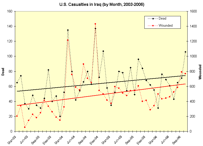
I have added two linear regression trend lines. On the one hand, as has been discussed on this blog before, a linear regression is somewhat arbitrary since there is no reason to expect a linear relationship. On the other hand, it is a crude and common statistical measure that makes a simple point: security for our troops is not improving. If anything, it is getting worse.
8 comments:
Good work,Dr. S! It looks to me like the attacks are getting more deadly. The death toll is climbing in Sept. while the wounded toll is dropping slightly. Interesting and frightening trend.
// posted by USWest
Thanks, USWest. As for the trend you noted, I think there is some truth to the idea that attacks are becoming more lethal... but I should note a problem with the data: casualties take a while to be reported sometimes. Sadly, there very likely will be additional wounded and dead added to the most recent month that appears in the chart (October 2006).
I'm not sure I understand how both dead and wounded are plotted on the same graph with different units superimposed. I guess I should be careful not to compare amplitudes. My other question is whether I can deduce that the ratio of wounded to dead is increasing from this chart.
// posted by LTG
The (black) dead are marked in 10s and the (red) wounded are marked in 100s. If you look at the trendlines (easier to see) you can see that the *percentage* increase in wounded has been greater than the *percentage* increase in dead. So then yes, this crude measure would suggest the wounded-to-dead ratio has been gradually increasing.
I see - the two scales are linked.
I guess this is the impact of better body armor.
// posted by LTG
It could be better body armor... but it also might be a result of larger explosions. Depends how the raw number of attacks on U.S. personnel is changing.
As for the graph--could you explain a little more what puzzled you about the format? Was it just that the scales were not printed large enough to read?
My first thought was that it was strange that the numbers of dead and wounded tracked so closely. Then I realized that the tracking was an artifact because two distinct scales were being used. It wasn't clear that the 20-200 and 40-400 were meant to be the same lines.
// posted by LTG
Depends what you mean by tracking, I suppose. When two variables track each other, I usually just take that to mean that they rise and fall together--which of course the wounded and dead do in this case.
If it was not clear that the scales were different, I'm sorry. I probably should have put a note in the post text to that effect. I didn't bother to clarify that the 20-200 and 40-400 were on the same line, though, because that doesn't matter. I just rescaled the wounded by some arbitrary factor to fit both trends on the same graph.
Post a Comment